Fairfax County
Visual Identity Design
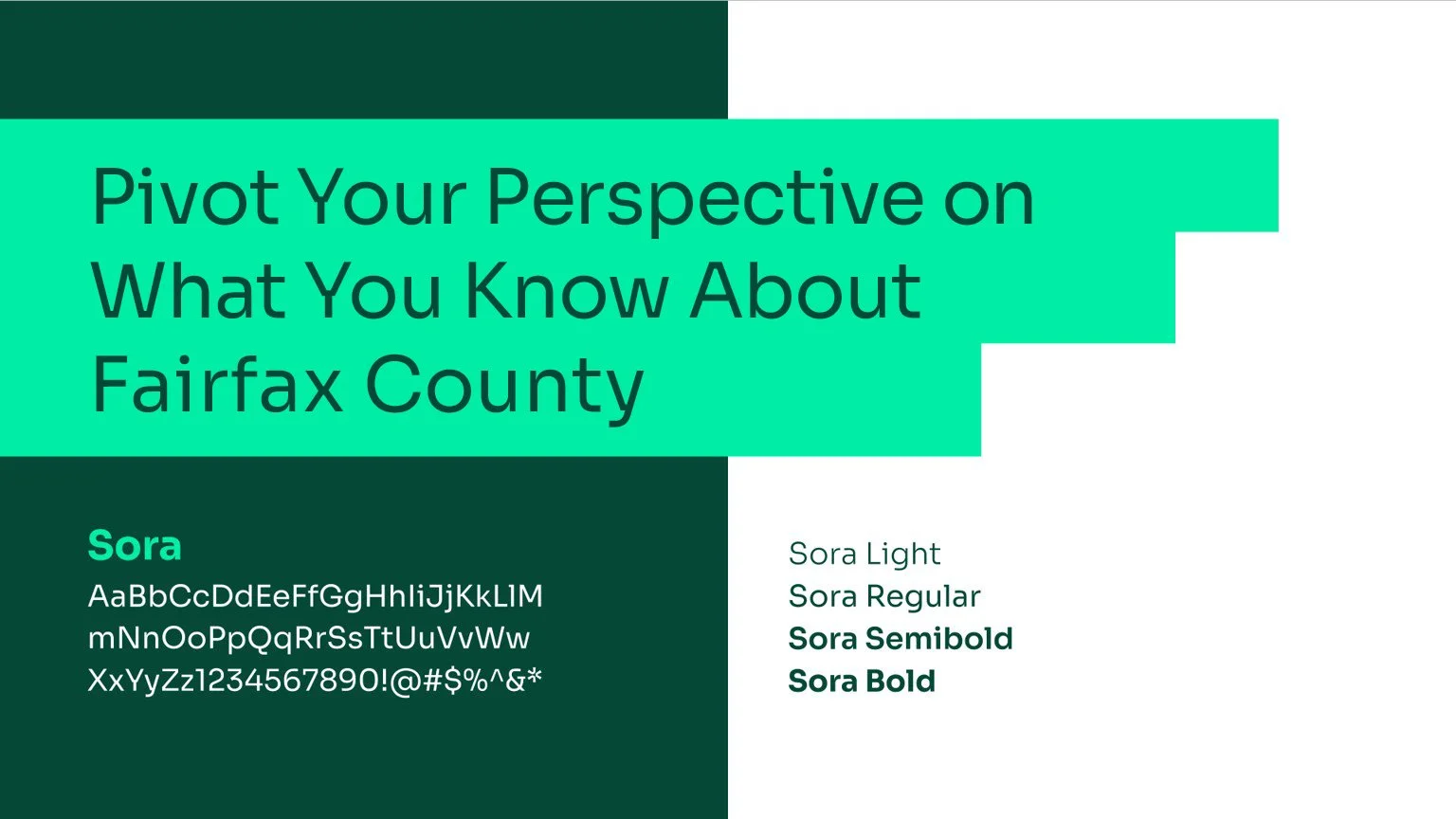
Pivot Your Perspective
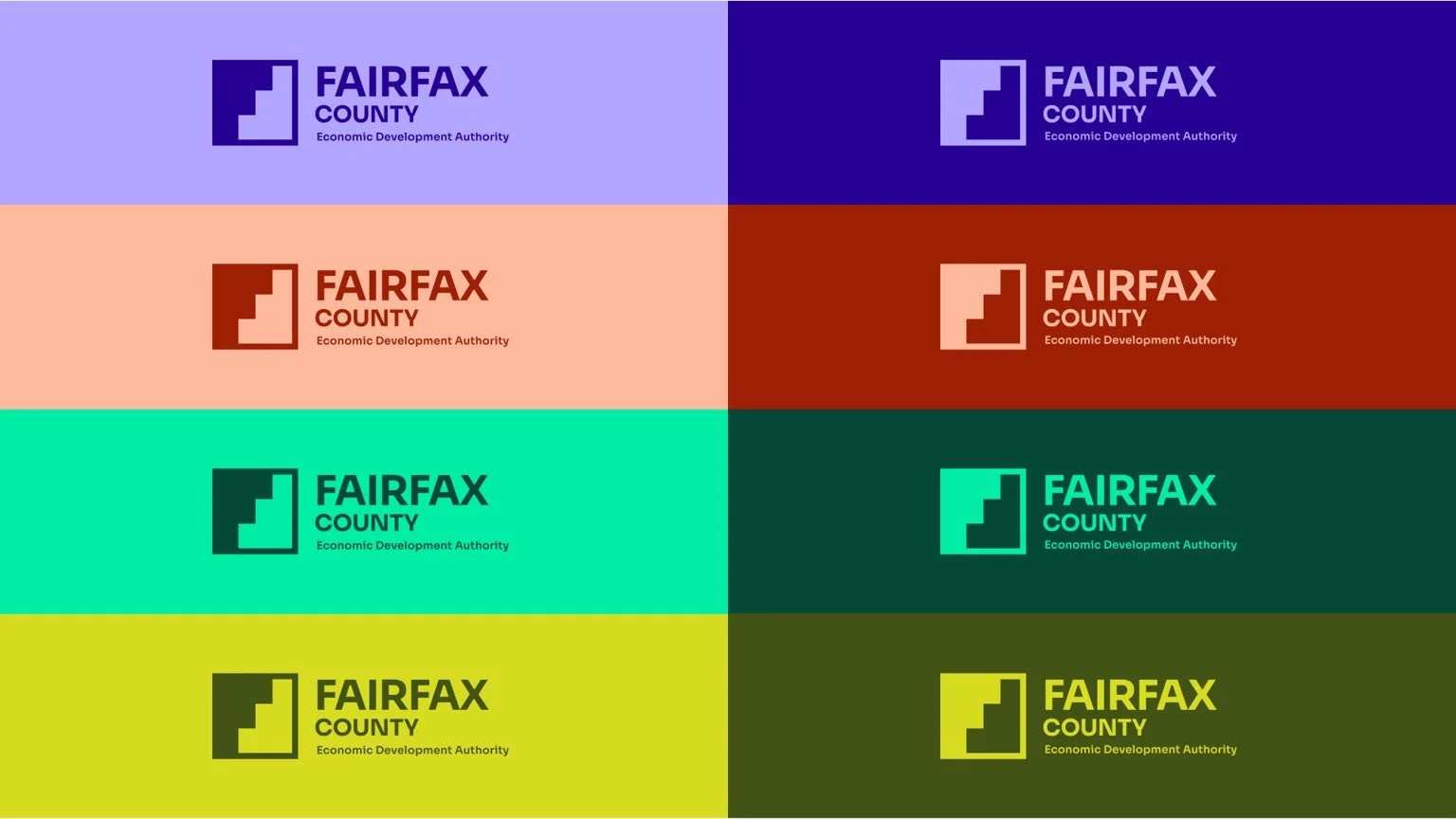
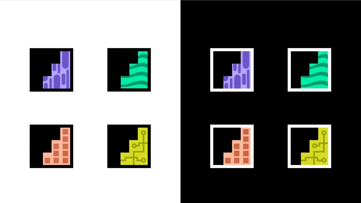
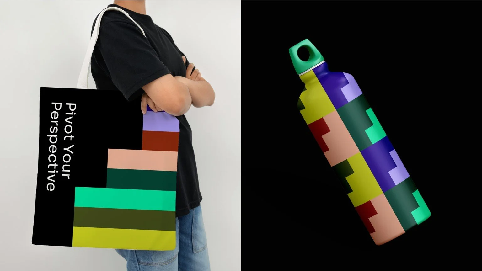
The Fairfax County Economic Development Authority brand was reimagined with a bold, modern visual identity. The “F” logo symbol serves as a conceptual and structural anchor, while the F-shape in the design system frames type and imagery, conveying elevation and forward momentum. A sophisticated color palette, modern typeface, photography that captures unique angles and sideways type treatments reinforce the “Pivot Your Perspective” concept, and the design system extends these ideas across brand assets.
Fairfax County wasn’t top-of-mind for relocating employers or rising talent. The brand needed to show the region as a modern, innovative hub where work, life, and play flow together.
The visual identity breaks from outdated rural and traditional associations, highlights Fairfax’s diverse industries, and positions the region as a place where employers and talent can thrive. The design system reinforces this fresh perspective and forward-looking energy, giving the brand a confident, modern presence.