BOK Financial
Design System
Patterns
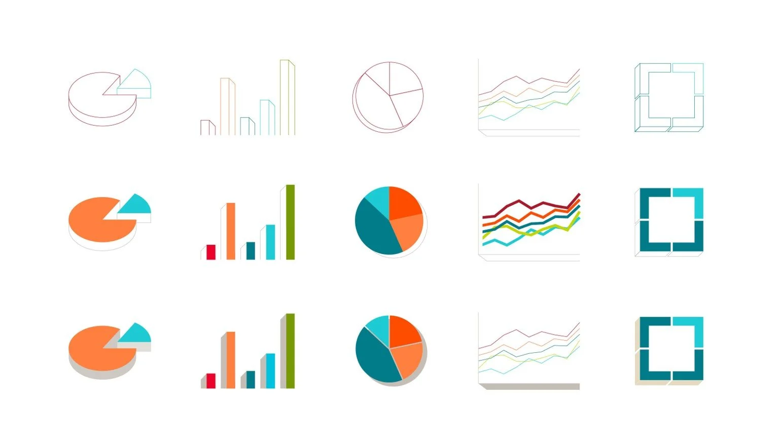
Data Visualization
Guidelines
Digging Deep
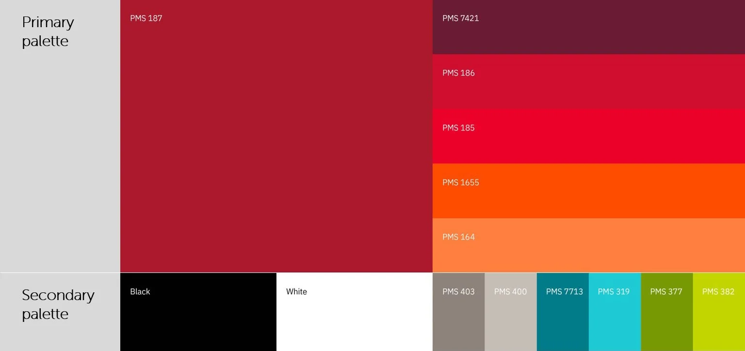
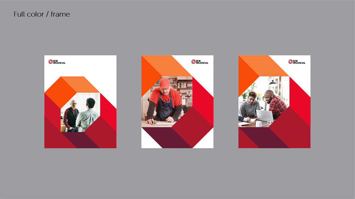
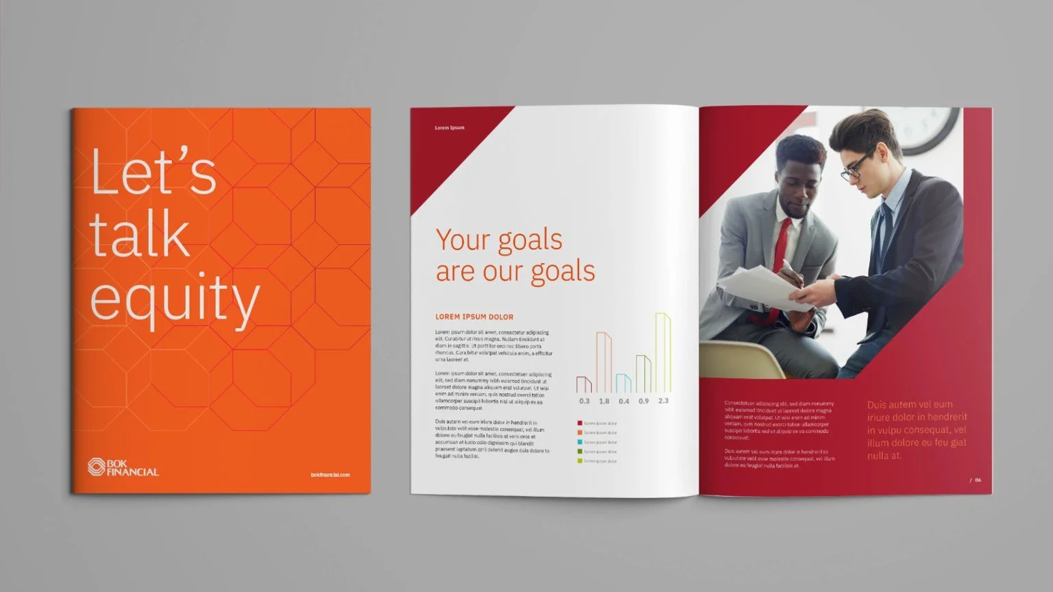
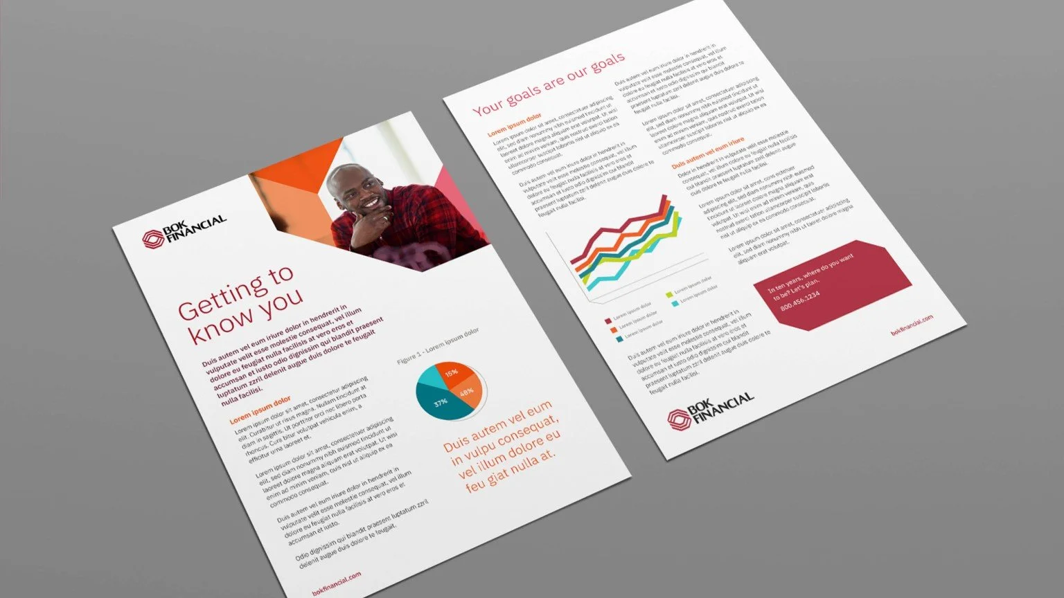
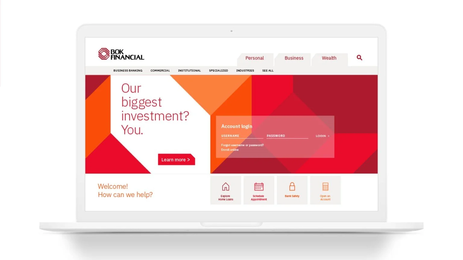
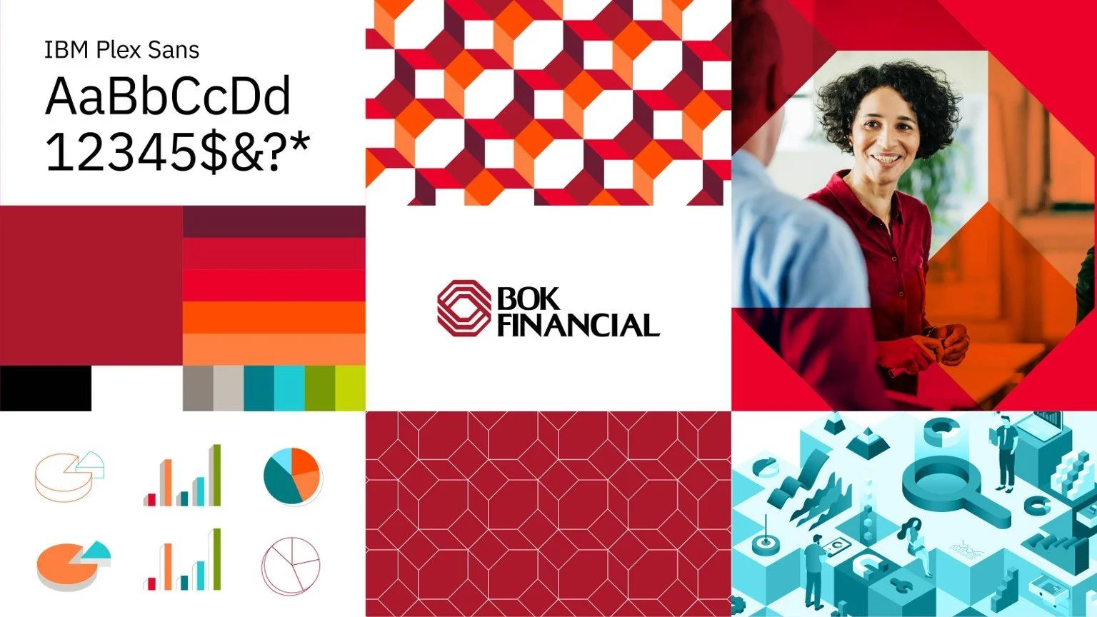
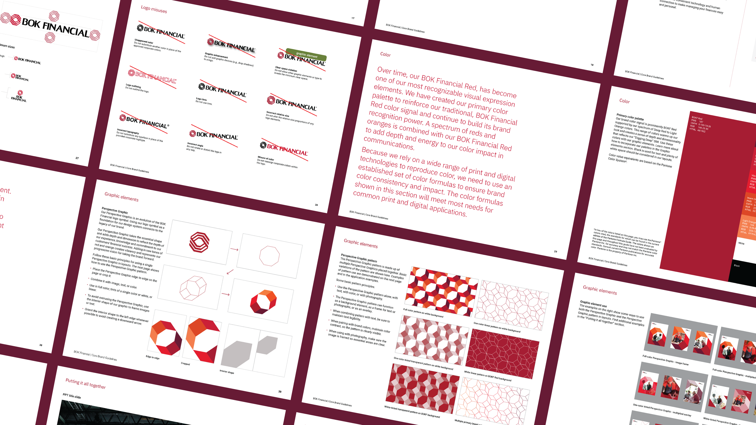
BOK Financial retained its existing logo while gaining a modern, bold design system that brings depth, dimension, and flexibility to communications. The design system evolves the logo symbol, connecting to the brand’s heritage while adding depth to reflect the organization’s experience, knowledge, and commitment to customers’ financial success. Applied as a singular element or in pattern treatments, it can stage imagery, photography, color, and type. A spectrum of reds and oranges extends the iconic BOK Financial Red, adding vibrancy and representing the brand’s progressive vision.
The system modernizes the brand while preserving its legacy, providing a versatile toolkit for bold, dimensional layouts across a wide range of touchpoints. Together, the expanded color palette, design system and brand assets strengthen recognition and give BOK Financial a bold, yet sophisticated visual language.