Rejuvant
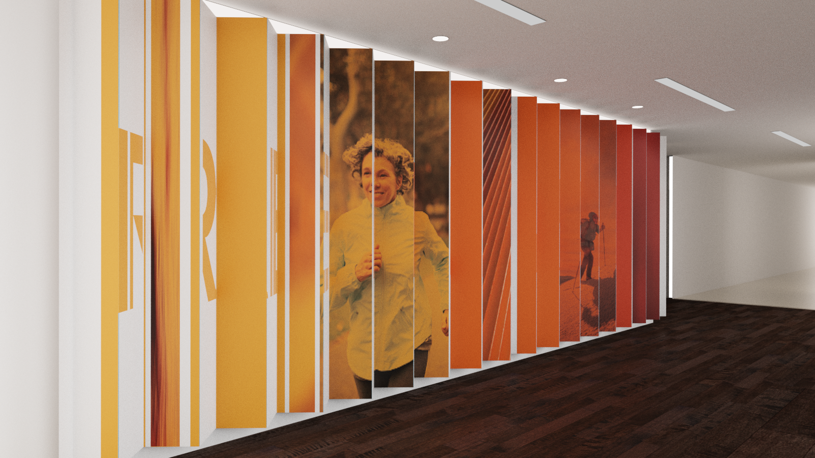
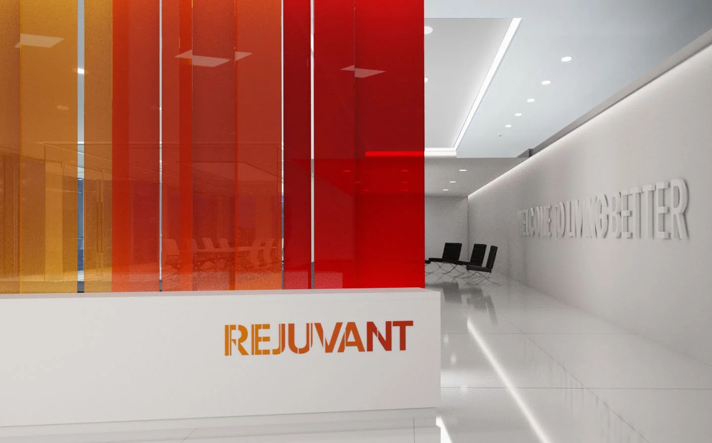
Visual Identity
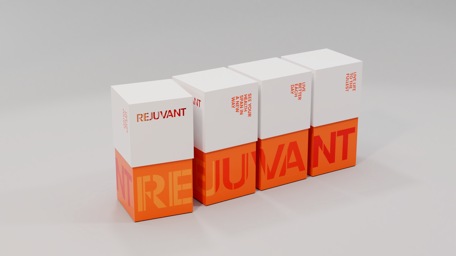
Package Design
The Span
A new logo, packaging, and design system were created for Rejuvant, a natural longevity supplement that enhances vitality and wellness. The concept centers on the idea of a span—the full extent of life, lived better day by day. This idea is expressed through segmented letterforms in the logo and carried through the design system as dynamic color bars and overlays. A vibrant range of oranges reinforces the energy and optimism associated with living fully.
Rejuvant needed an identity that would distinguish it in the crowded supplement market while expressing its scientific credibility and positive, life-affirming mission. The design bridges science and lifestyle, translating complex longevity research into an inviting, modern brand experience.
The resulting identity captures the brand’s promise of continuous improvement and vitality. The segmented design language creates a cohesive, recognizable look across packaging and communications, while the distinctive orange palette sets Rejuvant apart and conveys the vibrancy of a longer, more fulfilling life.